Jason YsenburgAs a painter working today, what are your thoughts on Tom Wesselmann’s process? Let’s start with Still Life #61. Can you talk about what you find interesting in this work?
Richard PhillipsOne of the first things that’s very exciting about this painting is how you literally get hit by the scale of the work.
JYYes, it feels large even in this space.
RPEven in this space where I’ve seen very big works, these seem to be the biggest. And it has to do in part with the outsized scale of the objects that are being painted—
JYEverything is supersized.
RPAnd there’s a three-dimensionality to all of the work. It is both illusionistic and factual. The objects that are being painted are decidedly—Ivan Karp called them “commonist” though that was pre-Pop, before Pop had even been coined as a style.
JYAnd what was his logic—
RPThey’re common everyday objects, so they’re commonist. [Irving] Sandler interviewed Tom in 1984, and it was helpful to read that before revisiting this show, because I wanted to know what he might have been thinking about when he was making these works. One of the interesting things I learned was that Tom was really not so interested in still lifes per se, that he was more interested in the final result, what’s beyond still life, and beyond those ideas. The effect of it, and you can really see it in these paintings.
JYBut he liked the idea that a still life painting was traditionally very small.
RPWell, on a smaller scale there is a more one-to-one relationship with reality. But this show obviously explodes that, negates it, so it becomes something else entirely. Further to that, what’s really interesting for me about these paintings is that there is a built-in visual hierarchy of parts that are richly rewarding and other parts that are surprisingly and almost disconcertingly not rewarding.
JYWhat do you mean by “not rewarding?”
RPWell, I think it’s deliberate, a showing of hierarchical structure.
JYAre you talking about parts of the works that you don’t see but that you know are there?
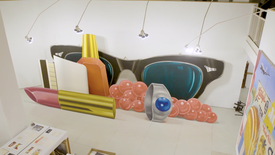
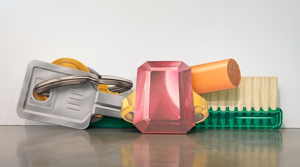
RPNo, it’s more like—with this particular painting, the gem that is foregrounded is painted with a dusty rose feeling, and yet the real drama of the painting is behind it, with the green Lucite toothbrush, which for me, on a personal level, is one of the highlights of the entire exhibition. It’s just an absolutely astounding painting. The key ring is equally brilliant as an example of painting illusion. By opening these panels up there is a sense of tipping and moving. He’s really playing in a really exciting way with illusion and what our expectations are about painting. That goes back to this idea that he cares less about the still life and more about the end impact, the end effect. These become elements or props for a feeling that he’s getting after. Successful painting needs to go that goes beyond a conceptual demonstration, it has to have some type of visual fact that backs it up. Within this particular painting, he establishes that hierarchy by surprising you with this dully painted gem and placing it in front of this brilliantly painted plastic toothbrush and an outrageously three-dimensional illusion of the keys. And you get an incredible sense of positive and negative space with these things. The outside edges of these cutout shapes and what you’re looking into are playing with what is cut out and what is actually painted. Painting becomes a description and it also becomes a setup for a kind of negation of itself as painting. That is a really radical idea. It’s very aggressively put forth. If you think about the time when these were painted, he would have like Alex Katz cutouts and certain types of dimensional works by James Rosenquist in his mind. There was a feeling for this going on throughout that time.
Even considering the magnitude of the paintings in terms of scale—he’s finding a way to bring us close to the objects. It’s not over-detailed but yet there’s enough seduction in the way that he’s painting it to make us curious about how he’s actually doing it.
Richard Phillips
JYAnd everything here is hand painted. Nothing is silkscreened or collaged.
RPYes, these are real physical challenges.
JYHe didn’t have a lot of assistants in this period, he really painted every canvas.
RPYes, you can really see that. One of the things I was interested in discovering was his relationship to Matisse. I know that has a lot to do with the idea of the muse, but it also has something to do with the still lifes. In that sense, it’s really more about a sense of beauty, of the power of beauty and what can be. Radical scale and beauty become these implements of power that he is really interested in, that he really is forcing on his viewer. Because of course he could have painted these any scale, but at this maximum scale, a whole other language outside of the history of still life develops that is wholly original.
JYDo you think their three-dimensionality creates a sense of collage?
RPYes, and in a sense collage is something that runs throughout—like that’s a guiding light through his whole career. That started at Cooper Union and continues when he starts showing at the Tanager Gallery. That was really what separated him from other artists, and created his own. From what I understand, he was very conscious of wanting to find clear air, like find a separation so that he can work. That key ring is really outrageous!
JYIt never loses its three-dimensionality at that scale.
RPI wonder what Frank Stella would think, because these are things that he ended up taking on in the 1980s. Was he trying to break out of his own realm of dimensionality? But the illusions that these are creating are so dramatic and in a way they encapsulate—because it’s not just like odd brush strokes and bending surfaces. It’s precision painting, creating these illusions because they are images after all. And with the cutout the images become allusions to another type of form. These are entirely unprecedented paintings.
JYThere’s nothing like them that precedes them.
RPIf you look at a Dutch still life and you see the painting of the lemon with its peel hanging off of it and the lobster in the background, there are hierarchies involved. In this case when you’ve got the keys, a cigarette, a toothbrush, you have this kind of hotel room, you can speculate about what’s going on elsewhere.
JYHe said they were his belongings but obviously the ring belongs to somebody else and he never really refers to who that could be.
RPAnd the images are coming from magazine advertisements, so he could cut out those images and assemble them and decide how to approach them. There was a radicality in the design combinations for the works. And of course he could have painted the gem to be as deep as the toothbrush, but he chose to approach them differently. The gem has this very dusty feeling with hints of glimmer and glow and that allows the keys—
JY—everything else to shine.
RPOne of the more technical things that I was really taken by was the way the bristles of the toothbrush go into the plastic. I mean, this is great skill.
JYIt’s magnificent and almost 20-feet long. And the work itself is over 32-feet long.
RPAnd the care. It’s like the care that goes into the painting of the bristles compared to the plastic, to the tobacco. When you look at the tobacco—is that a cigarette?
JYIt’s a filter.
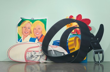
Tom Wesselmann, Still Life with Belt and Sneaker, 1979–81, oil on shaped canvas, in 4 parts, overall: 119 × 238 × 29 inches (302.3 × 604.5 × 73.7 cm)
RPSo you see him finding a shorthand for a realism. We’re going to get into that in other paintings because this show gets into some really extreme, situations with how to paint reality or how to negotiate reality.
JYLet’s talk about a work that was only ever seen once before, it’s Still Life with Belt and Sneaker (1979–81).
RPOne of my all-time favorites in the show because of how utterly strange it is.
JYIt’s the only one where there is a background color on the wall behind and that same color appears as the wall in one of the panels of the painting. The dimensionality of this work is completely extraordinary.
RPOperationally this painting has some of the most exciting dynamics in the entire show because there are so many conflicting agendas going on. Yet for me it really works on so many different levels.
JYWhere should we start?
RPThe illusion in this painting is incredible. What’s really exciting is the care he took in painting this belt and the texture of it. You can see the undulations that have been carefully painted into it. Yet the buckle is cut out. Then when you look through the loop of the belt into the illusionistic part of the painting, you can see that the background wall behind the belt is not cut out, it’s painted to appear cut out. And that decision is a really important one because it’s really showing us that there’s illusion and there’s also a collage aspect of the work. Part of the reason that has to be painted is so the photograph steps back and sits on the actual wall.
JYYes, the photograph itself appears to be completely seamless and flat on the wall yet it’s not, it’s another canvas. From a distance, essentially the sweet spot, everything is in flux.
RPIf you think about the dimensionality of these works, you might assume that they were meant to be seen from different angles, from the side and all that, but these works are very frontal. He’s controlling.
One of the fascinating parts of this work is how he deals with the family picture pinned up to the wall. We can see what the language of how to paint a giant sneaker is, we immediately absorb that. We absorb how flowers can be painted big and this all has to do with a kind of negotiation of billboard parts, we can kind of figure that thing out but the shorthand that he has to come up with to paint a photograph, and this happens in other paintings within the show, is utterly bizarre. It has a very unusual appearance, because it’s not like his other paintings. It’s not like the large nudes, it’s some other way of trying to stylistically place a realism within the ultrarealism of these outscaled domestic elements.
JYHe had made an alternative panel for the photograph.
RPI’m sure he did. [laughter]
JYIt was originally a blonde and a brunette rather than two blondes. He wanted a very particular image for the overall composition. It’s taken from a chewing gum ad—but you’re right that the figures in all of the works in this exhibition are quite different stylistically from the figures in his other paintings, that are in the Bedroom Paintings or the Great American Nudes. So there’s a very conscious decision. He’s very much in control. Nothing is un–thought-out in these works.
RPYes, the inventiveness of having to deal with a photograph in a big still life—it destabilizes a number of the works. He was fully capable of painting those portraits photorealistically, he didn’t because they would have wrecked the experience. There had to be a negotiation of what this reality should look like, which is really just another aspect of illusionism that had to be dealt with. Think about that in combination with all of these positive/negative parts, and the complexity of building color harmonies even within that. These really are fantastically complex and very unusual. The one in the other room even has a self-portrait.
This show is so surprising because our defenses are let down and we get to absorb more of these unusual parts and deeper workings of his mind.
Richard Phillips
JYWe’re going to talk about that.
RPIt’s like we are getting into deeply personal idiosyncrasies.
JYIt is deeply personal, but at the same time he’s taking on a role. You know, he had an alter ego, Slim Stealingworth, he wrote his monograph under that pseudonym.
RPI think there is an aspect of alter ego. This show is so surprising because our defenses are let down and we get to absorb more of these unusual parts and deeper workings of his mind. It’s a sympathetic relationship to things that are meant to push you back at the same time. He creates abstract tensions that are simultaneously physical and temporal.
JYThey’re very disarming but they’re also extremely welcoming and enjoyable and playful. The sexual tension that’s quite overt in a lot of his other work is just implied in this work and then sometimes it makes that feeling, that sensibility, a little bit more acute.
RPOne of the things that he talked about in this interview with Irving Sandler is the way that objects could carry meaning.
JYStill Life with Blue Jar and Smoking Cigarette was the final Standing Still Life, which he made in 1981. It is just three elements.
RPThis is so wonderfully classical minimalist. It’s the most abstract work in the show and I have many favorite parts, particularly the abstract floating smoke, which is almost bladelike, like a barber’s razor blade that hangs out in thin air, behind the orange. One of the nuances of his technique that I love is the glow of the cigarette ember behind the smoke on the tip of the cigarette. You see the smoke coming off the tip of the ash and within that he’s taken the time to show the glow of that, using just a touch of orange and grey.
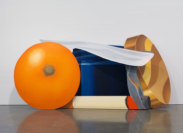
Tom Wesselmann, Still Life with Blue Jar and Smoking Cigarette, 1981, oil on shaped canvas, in 4 parts, overall: 108 × 221 × 66 inches (274.3 × 561.3 × 167.6 cm)
JYDo you think he just understood that it would look absolutely fantastic with that deep blue background?
RPYes, one of the great things about his work is his understanding of value and chroma, he knows when to step on the gas and when to step on the brake. In this case, a lot of the neutral grey tones and off-white tones in the cigarette itself allow for the orange and the blue and gold to just gleam at the top level. But within those more monochrome moments of the painting, this is where his excitement for color and how things get painted is really articulated. And all of this becomes a ruse for getting to that end point and how he gets very excited by his own painting. That’s one of the things thing that he got from Matisse. He was startled by how enjoyable the paintings could be and how beautiful they were so he looked at them very critically and whenever he got close to figuring out why they could be that way, he rejected that. But at the core it’s really about that excitement—you can see it in how the orange is painted.
JYIt has a kind of sunshine glow to it. And it’s about 9-feet tall as well.
RPThere’s a nipple aspect to it and I love the way the gradations are not spray painted, they’re brushed out. From personal experience, brushing out gradients at that scale with these types of colors is something that takes a great deal of time and commitment to do. And all of the transitions in these where you go back and look at the flat surface of the key, the modulation in the paint to create that feeling is something that you have to commit to.
JYI was just thinking about the lid of the jar.
RPAnd then you can see the bit of orange glow.
JYIs that a glow from the cigarette?
RPYes. It’s a glow from the ember. He’s thinking across space, he’s always two steps ahead of your attention, two steps ahead of how far you’re willing to go. Yet, that would almost presume overdetailing, except he uses a Pop shorthand to keep you at a pleasurable distance of disassociation, which is something that a billboard painting would have and here it’s being done with very carefully painted oil paint. He’s consciously creating a sense of ease, so you’re not concerned with how he did it. He really wanted the viewer’s eye to pass freely over the paintings.
JYIt’s incredible to keep that level of intensity consistent because all of these works were made over a long period of time. This one work was painted over a two-year period.
RPWhen you paint a 9-feet tall orange, it’s a massive commitment.
JYYou can’t do it in one go, can you?
RPNo, but in some ways you almost have to—unless he’s using poppy seed oil or something like that, where it stays wet for days. In some cases we are seeing an aspect of technical control that allowed him to paint endlessly on certain forms because it would be nearly impossible to articulate such a large form in one sitting. There’s also a nice density of paint on there. There’s no impasto and yet it’s not an anemic presentation of paint either. He seems very particular about getting a consistent surface.
JYLet’s go next door and have a look at three other works. Bedroom Painting #32 which includes his wife Claire, in bed, on her side, heavily made up, and then a portrait of Tom painted in a way that’s completely different from everything else in the show.
RPWhat makes this one of the most compelling paintings in the show is that he’s now stepping into unknown territory by creating this incredibly intimate portrait of not only his wife but himself in relationship to her. He has to come up with a new type of realism for the image of his wife at this huge scale and then for his own self.
JYShe’s like a reclining Buddha, lying on her side, there’s something quite hypnotic about her.
RPWhat I really find amazing is the way that he paints flesh tones within the language of how he’s painting objects. At this scale, the colors cannot go into realistic tones because they would be too dull, so it’s an orangey-pink color that’s brought up and used quite uniformly. In a way, the heavy eye shadow and the gaze gather up what would otherwise be a very difficult type of painting of flesh tones. Everything has to be kept in a careful tonal range to remain in that light, carefree painting tone—it’s almost like he’s battling representation in these paintings. More outrageously, look at his portrait, his forced-perspective photograph, in a frame from head to toe.
JYIt’s based on a photograph that they found at his studio—he was dressed similarly to this but he changed the background.
RPWith salmon-pink walls and his blue coat, jeans, and hat. And the wrapping that’s holding flowers that are presumably a gift or something given to his wife, with a gradient pink, which is beautiful, it’s is one of the highlights of the painting to see the way it goes from pink up to a brilliant red orange up where it meets the flowers. It’s as if the color is coming out of the framed portrait. If you look at the orange of the wall, the pink of the paper holding the flowers and the flesh tone—
JY—it’s all connected. Everything is beautifully related.
RP—there are harmonies of color that he’s really obviously very excited by and very proud of. Even considering the magnitude of the paintings in terms of scale—he’s finding a way to bring us close to the objects. It’s not over-detailed but yet there’s enough seduction in the way that he’s painting it to make us curious about how he’s actually doing it. And it’s such a great surprise that he’s using the black panels on the floor to create a counterpoint for how dark the black satin pillow gets.
Tom Wesselmann, Bedroom Painting #32, 1976–78, oil on shaped canvas and painted platform, in 2 parts plus platform, overall: 102 × 190 ⅝ × 85 inches (259 × 484.2 × 215.9 cm)
JYIt’s another texture.
RPIt feels black and yet the black satin pillow goes all the way down to that darkest dark.
JYBut the floor also makes you feel like you’re entering a very intimate space. It’s one of only three works in the show that has a floor.
RPThe tonality of the framed self-portrait only goes so far, it never reaches the darkest dark because it has to remain a photograph. It’s only in the portrait of Claire with her eyeshadow, mascara, and satin pillow where we see color being allowed at its full measure of impact.
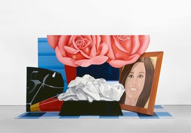
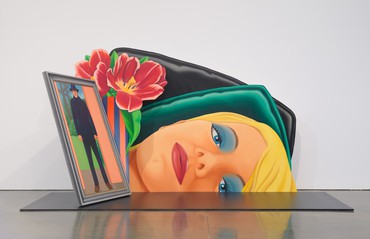
JYLet’s go talk about Mary Tyler Moore because it’s just the strangest and most compelling for me in the show.
RPWell, the celebrity figure in this work adds a whole other dimension. One of the things that’s interesting about Pop art and particularly about Tom Wesselmann’s approach is that this notion of celebrity usually pointed towards his own style, his style is a celebrity. In a lot of ways Pop art, excepting Warhol, was focused on style, the style of art became an entity that was celebrated first and foremost, it was foregrounded. Yet here you have this omnipresent 1970s television figure. And the ease with which he’s carrying off this very specific framed illusionistic portrait that’s leaning against the wall under these gigantic roses is stunning. Then you have the tissues.
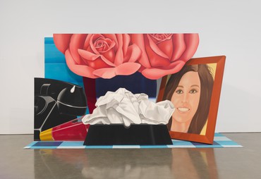
Tom Wesselmann, Still Life #59, 1972, oil on shaped canvas and acrylic on carpet, in 5 parts plus carpet, overall: 105 ¼ × 190 ¾ × 83 inches (267.3 × 484.5 × 210.8 cm)
JYIt’s a very strange context to have an ashtray with a crumpled up tissue in it.
RPAlmost as if you were crying because Rhoda found out she was sick or something. [laughter]
JYNo, the context is very strange. And the phone cut in half and the nail polish tipped over. It’s a messy side table.
RPWith these beautiful flowers, which again, are held back in a certain way. The pinks and the drawing of it. If we took the portrait of Mary Tyler Moore on its own and just hung it on a wall it would be very bizarre.
JYExtremely bizarre, you would wonder what point he’s trying to make.
RPHe’s creating a hierarchy of importance within the still life, which is ultimately what still lifes are all about, creating tensions and dynamics in terms of alluding to other scenarios. We look at these works and their scale and they remind us of contemporary large-scale superrealism in painting, but the difference is that every single part of these paintings has been worked over and considered and painted with a great deal of passion. You can really see that everything matters, every part of it matters. And he’s showing truly masterful control. He’s guiding us on how to get into these very odd personal moments. This show really shocked me, over and over again.
Artwork © The Estate of Tom Wesselmann/Licensed by VAGA, New York. Photos by Rob McKeever. Video by Pushpin Films